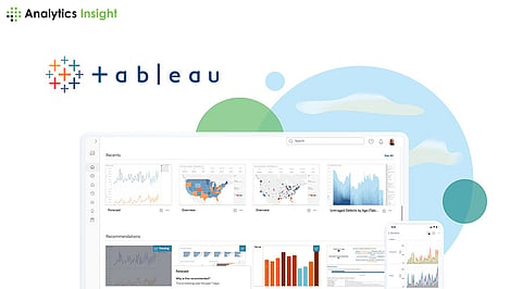

Tableau is an extensive and powerful tool for data visualization since it allows one to build interactive, sharable dashboards. Tableau provides a user-friendly interface with robust functionality to support the translation of raw data into meaningful insights. This step-by-step tutorial will get you through the basics of using Tableau to visualize your data effectively.
First, download and install Tableau Desktop from the official Tableau website. Tableau has a free 14-day trial that is more than enough to learn its basic input. After installing Tableau Desktop, open it and have a tour of the interface.
Tableau supports all basic and advanced sources of data, such as Excel or SQL databases, or cloud services. To connect to a data source:
Open Tableau and under the "To a File" section, click "Connect".
Select a data file – it could be an Excel spreadsheet or a CSV file.
Tableau will present you with a preview of your data. It will identify the text, numbers, or dates appropriately.
Before building visualizations, you are probably going to need to clean and prepare your data. Tableau provides the means to perform light data cleaning. For example:
You may rename fields for clarity by right-clicking on the field name and selecting "Rename."
Change data types if needed by right-clicking the field and selecting "Change Data Type.
Make calculated fields with any of the derived metrics you need. Right-click on a data field | "Create" > "Calculated Field " and define the calculation.
Drag and drop fields to the Rows and Columns Shelves to build your visualization.
Choose the type of graph that best suits your data. Tableau offers a lot of types of charts, among them, you'll find bar charts, line charts, scatter plots and maps. You can change your chart type by clicking on the "Show Me" panel on the right.
Customize your view adjusting colors, labels, and tooltips. For example, drag a field to the "Color" shelf to color the mark and be able to distinguish data points.
Dashboards are multiple visualizations combined into one interactive view in which a user gets insights from data on various dimensions.
Create multiple visualizations as was explained above.
Click on the "Dashboard" tab at the bottom of Tableau's interface.
Drag your visualizations to the dashboard canvas from the "Sheets" panel.
Adjust the layout and the size of each of the visualizations for readability.
Activate interactivity: with filters; e.g., create a filter that will refresh all visualizations when a user makes a selection.
Filters allow a view to narrow down the data to subsets relevant to specific analyses. To add filters:
Drag a field onto the "Filters" shelf.
Define filter criteria; e.g., particular dates, categories, or ranges;
Display filters on the dashboard: Right-click the filter and select "Show Filter". Now users can work with these filters in the dashboard itself.
Now that you have your dashboard ready, you can easily share it with everybody out there. To do so:
Save your workbook: Click on "File" > "Save As."
Click on "File" > "Save to Tableau Public," a free service. This will run your dashboard online.
Share the URL with your audience or embed it into websites/blogs
Keep it simple: The most important thing about visualizing data is not carrying any unwarranted clutter and zeroing in on the real key data points.
Color schemes: Colors will help illuminate new findings, but use them carefully.
Context: Add titles, labels, and tooltips to provide context for the data.
Test for interactivity: Make sure filtering and other interactive elements are working properly.
Solicit feedback: Share your visualizations with colleagues and ask for improvements.
